


Hello and welcome to my Design History Album Covers! My design class was given this assignment and I'm here to explain my process and show you the final products.

Formstorming is an act of visual thinking. I was given the assignment to chose a subject and show it in 64 different ways. I chose H20 and included photos including dyed water, watercolor, ice, mist, snow, and H20 molecules. After I created this project I was told I was going to combine with another, hence the design history album covers.

For this album I got The Memphis Group. I always start a new design project with a mood board and a thumbnail sketch. I usually end up changing a couple ideas later, but I like keeping the original mood boards. Keeping the originals helps me see where I started, and where I got my new ideals This one was personally very challenging for me. This was the one i spent the most amount of time on. You will see later that I ended up changing a color and adding a couple more. I even decided on changing the font. The font was another problem of mine just because you don't ever see a set font for The Memphis Group. I knew for this project I was going to need bright colors and patterns.
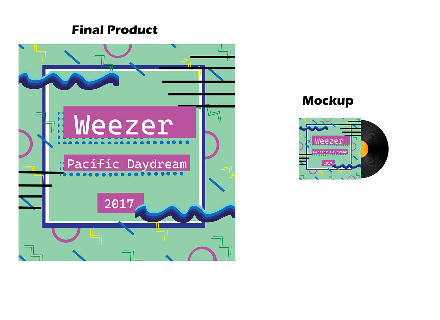
This ended up being my final project and my mockup. I chose "Weezer" the band for my albums covers because I felt like I could use them in these three different designs. I ended up using the blue waves on the sides of the box to represent the water along with the album name "Pacific Daydream". I ended up using the "Cascadia Mono" regular font which ended up working out really well. Overall I am very happy with how this turned out.

My second album I got The Bauhaus. The Bauhaus involves a lot of lines and(mostly but not all the time) Primary colors. I ended up using the same colors on the mood board and the same font. I found out later that this font can be overused so I wanted to use it in a different way.

This was the Final product for the Bauhaus Album cover. For the font I stretched out certain lines of letters to take over the whole album and be my main focus. I used the waves on the top(left) and bottom(right) to represent the water once again only in Bauhaus form. I added more lines and shapes to fill up the space and not feel so empty. For me this was the easiest album but only because I make more organized and graphed designs anyway.

My last and final one was Wolfgang Weingart-Swiss Punk. I Absolutely love this graphic design, but it was the hardest one for me. If I could describe this in anyway in would be graphed chaos. The color theme for this stayed the same throughout. Unlike all the other albums though I actually included a photo of water. Getting the layout down took a lot of focus and work. I wanted to able to see all the elements but there was so many it was kind a like fitting in puzzle pieces.

Although this one was the hardest for me it's my favorite. I ended up changing the font to "Eras Bold ITC" regular. I didn't just use a photo of water but also a polaroid and a record. Wolfgang Weingart-Swiss Punk has a lot of lines, arrows, whites, greys, black, photos, and bold lettering. I tried to incorporate a little of it all with it being too overwhelming.

(left to right, The Bauhaus, The Memphis Group, and Wolfgang Weingart-Swiss Punk) I'm including these photos as a review on the original graphic designs so that anyone can make their own opinions on either how I did or how I could have changed anything to make it more of that certain style. Thank you so much for viewing my project and process. I hope you guys enjoyed it and make make some of your own!


